
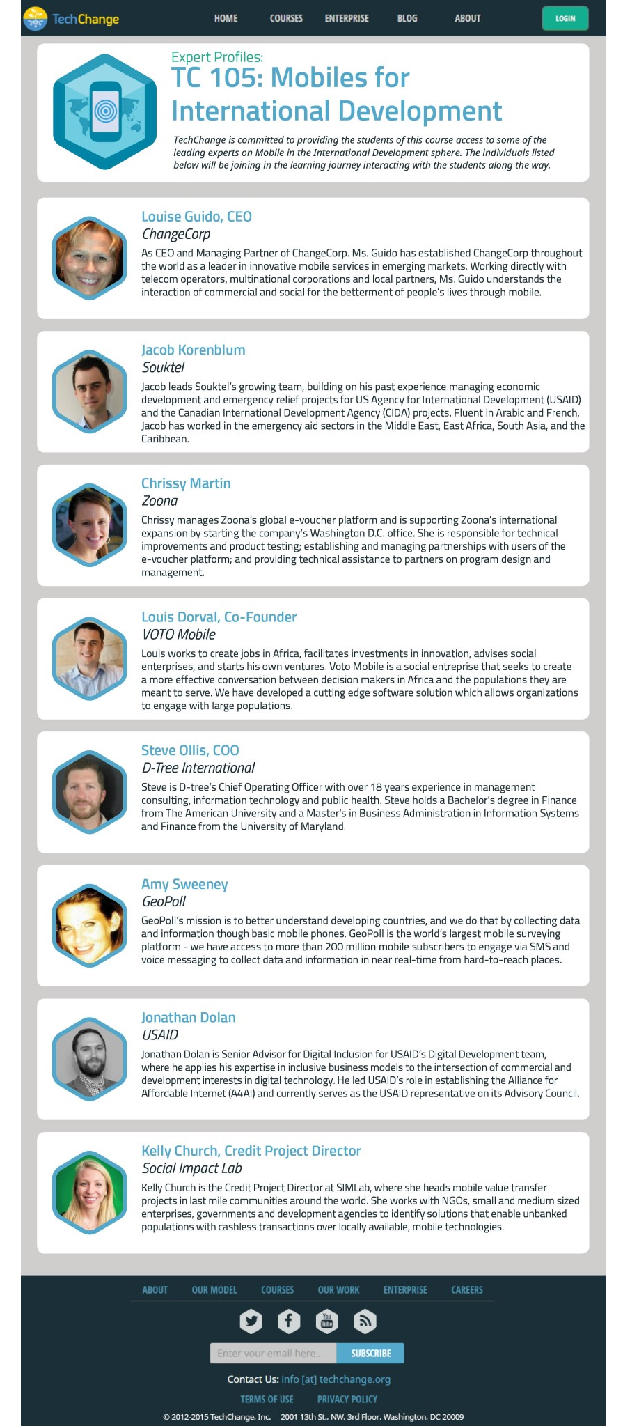
TechChange.org trains NGOs, the World Bank, and UN agencies to use technology for rural health care, delivering aid, mapping disasters, and dealing with humanitarian crisis through online classes. They needed a redesign for their course purchase flow. They were experiencing a drop-off of 56% of their visitors and were facing several usability issues on their site.
“You can’t just walk up to someone and propose marriage. You want to create a relationship with the user and move them up the ladder until they take the action you’re looking for.”
ITS ABOUT:
Relationships: Tailor the exchange of information - don't ask students for information (personal or payment) unless we have taken the next step in the relationship.
Personalization: People want the ability to save personal and payment info and email preferences once they have created an account.
Tangibility: To make an online purchase feel more concrete, we had to address what assets could translate from an online experience.
Information Hierarchy: The information students wanted to see first and whats truly important when deciding on a course.
Accessible Content: No matter where in the world you are, or who you work for, the information should be easily accessed and understood.
USABILITY TESTS with new users
Task: Navigate through a few key pages and try to register an account and buy a seat in a class.
Discovered Issues: Not only was the site broken into two servers- preventing logged in users from returning to the main page, but there was so much information on the pages that users were just scrolling through, and not spending time reading crucial information that would help them decide to buy a course.
SOME SURVEY RESULTS:
With this in mind, we created a survey for people who had previously taken any online education course. Our goal was to figure out what people wanted to see first when they were selecting a course to spend $450 on, and what made them want to choose a class and not perhaps, a nice weekend at the beach.


PERSONAS:
We interviewed twelve alumni for their feedback and met with TechChange to determine their typical student demographics and our personas. Hector, a returning student, was the persona we designed our flow around, but we also created two others that were newcomers to TechChange- one was an aid worker in Ghana, and the other was a volunteer for the Red Cross.
We spent several days laying out the current flow for the website and then redesigning it for greater efficiency, as one of our key requests from the project brief was to lessen the amount of pages a visitor had to click through in order to buy a class. We concluded that the application was not actually functioning as an application and that we needed to eliminate that as it seemed to be misleading the students and creating a barrier for completing payment all at once. To the right is our final flow:
DESIGN STUDIO:
As a team, we sat down and participated in a design studio session, so that each of us could contribute our vision for the new pages. After reviewing everyone's ideas, we combined several different layouts to agree on our final design for our pages and created our paper prototype for testing.
PAPER PROTOTYPE SAMPLE PAGES:


DIGITAL PROTOTYPE:
After testing several iterations of the paper prototype, our team determined which visual assets to carry over from the current site to our redesign, since TechChange has several talented graphic designers on their team and our testers enjoyed the visual components of their page. We used these in the digital prototype which I've selected a few pages to show below:


EMAILS TO STUDENTS:
In order to build the relationship between TechChange and their students we created customized emails that would also help foster the feeling of the purchase of the course being a more tangible, concrete experience. The feedback we got from our surveys told us that that a few key components were expected after they bought a class: An introductory email from the teacher, which should include course pre-work, a calendar and a syllabus. The alumni and our usability tests also showed us that people expected to be connected to other students prior to the start of the course, so we built in a student forum where the students can get to know each other and maintain excitement while they wait for the start of the course.


DETAILED EXPLANATION OF CHANGES To course listing page:
Please select each image to enlarge and to read the explanation of changes we made.


